The short answer
Choose an image shape that supports the message, then verify the exported file and the actual upload preview. LinkedIn’s photo help currently lists a 5 MB limit, a minimum of 552 × 276 pixels and a 1080-pixel width recommendation. Those facts do not guarantee readable labels or an identical crop everywhere.
What you’ll take away
- Treat pixel dimensions, file size and display size as separate checks.
- Put essential meaning in the caption and a suitable text alternative.
- A recommended width is a starting point, not a universal format winner.
Separate an upload rule from a design choice
Use the current help for the actual surface you are publishing to. An ordinary photo post is different from a profile banner, a document page or a paid advertisement. A dimensions table for ads should not be treated as an enforced rule for every organic post.
For an ordinary photo, the listed file-size ceiling and minimum dimensions are acceptance constraints; the recommended width is guidance. Inspect the exported file itself. Changing a design canvas does not prove that the downloaded file has those dimensions or stays within the upload size.
Choose a shape around the information
A square 1080 × 1080 canvas can be a convenient original starting example for one compact idea. A wider diagram may need more horizontal space; a tall explanation may work better as several readable document pages. These are design choices for the material, not measured claims that one shape earns more reach.
Keep meaningful labels away from edges that a thumbnail or another surface might crop. Do not solve a dense spreadsheet by shrinking everything until it fits. Redraw the relevant comparison or move the detailed table to a document, with the key finding explained in the accompanying post.
| Material | Useful preparation choice | Check |
|---|---|---|
| One comparison | One image with a clear unit and labels | Can the reader identify the actual comparison? |
| Wide detailed table | A selected excerpt or a document | Does the excerpt retain necessary context? |
| Several sequential steps | Separate readable document pages | Does the order make sense without animation? |
Estimate the small-display problem, then inspect it
In a constructed example, a 1080-pixel-wide export is displayed at 320 pixels wide. The scale factor is 320 ÷ 1080, or about 0.296. A nominal 36-pixel label would scale to about 10.7 pixels before other layout effects. That arithmetic is a warning about shrinking, not a legibility measurement on a real phone.
Open the actual export at a realistic narrow width and read the smallest meaningful text. Also inspect contrast, units, chart keys and the connection between a label and its mark. Enlarge text, reduce competing detail or change format if the central point is difficult to recover. A successful upload cannot answer that question for you.
Inspect the final file and crop
Export a public version without private client names, internal tabs or unrelated browser chrome. Check file dimensions and bytes after export, then inspect the uploaded version in the composer. LinkedIn provides crop/edit and alternative-text controls for photos; use the actual controls available on your device.
If a crop removes a unit, source note or needed part of a diagram, prepare another composition rather than accepting a misleading excerpt. Compression can blur thin lines and small labels, so compare the uploaded preview with the local export. Record the version privately if several similar files exist.
- Choose the actual publishing surface and check its current help.
- Prepare a public export with meaningful labels and margins.
- Inspect dimensions, file size and the narrow reading case.
- Review crop, attachment version, alternative text and audience in the composer.
- After an intended publication, inspect the actual post.
Make the central information available as text
A useful text alternative follows the image’s purpose. For a fictional chart comparing two review queues, identify the compared groups, unit and relevant difference; do not replace the explanation with a string of promotional keywords. Complex detail may need a nearby text summary or an accessible supporting document.
Keep the post’s main claim understandable without requiring perfect vision, color perception or an image download. This process helps prepare a readable asset. It does not verify every assistive technology, certify accessibility compliance or establish that the chosen dimensions improve engagement.
Work through an actual crop that loses the explanation
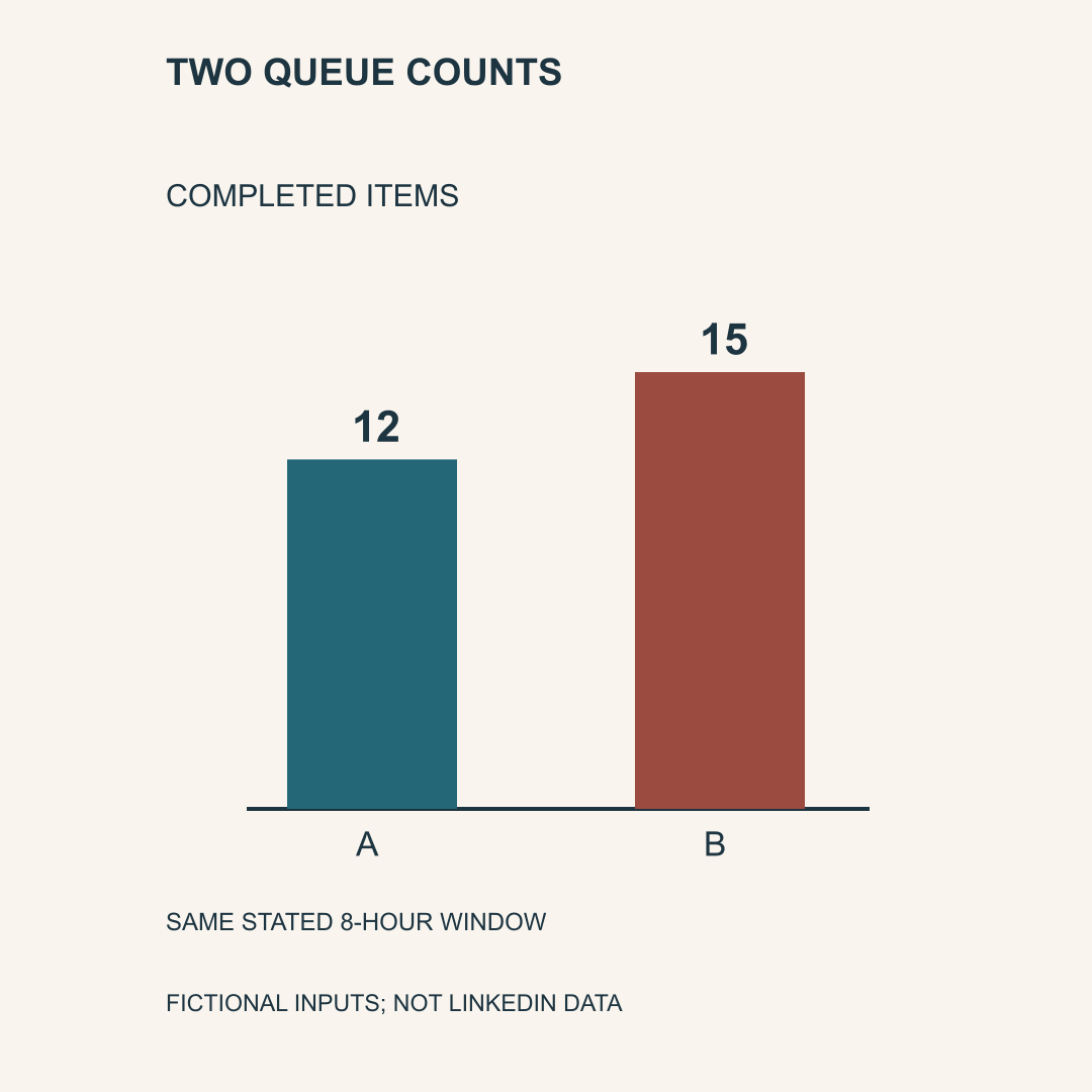
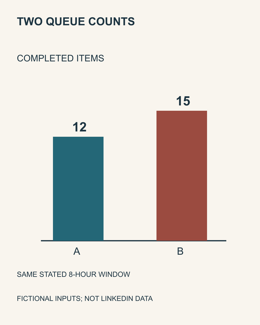
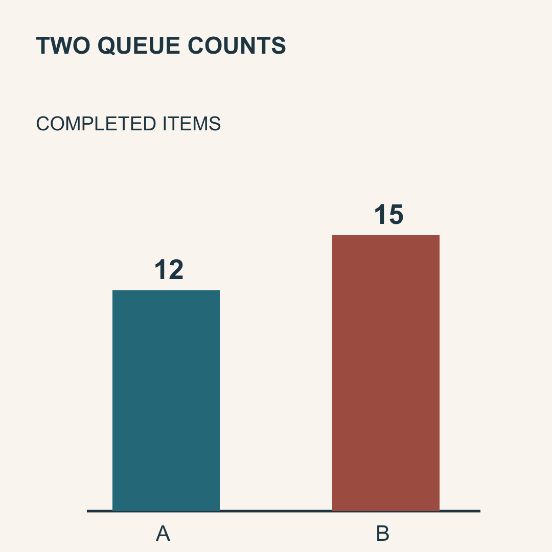
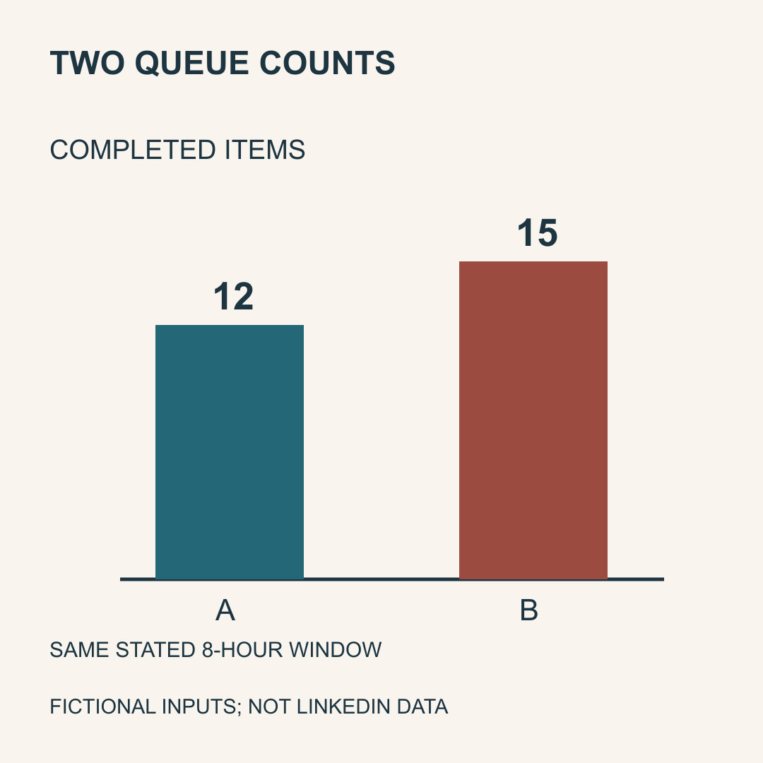
The original exercise below uses two declared fictional queue counts: A completed 12 items and B completed 15 in the same stated eight-hour window. The difference is three items. These are teaching inputs, not LinkedIn analytics, equal worker conditions or evidence that one method caused better performance. The chart names the unit, time window and fictional source so that the numbers can be interpreted.
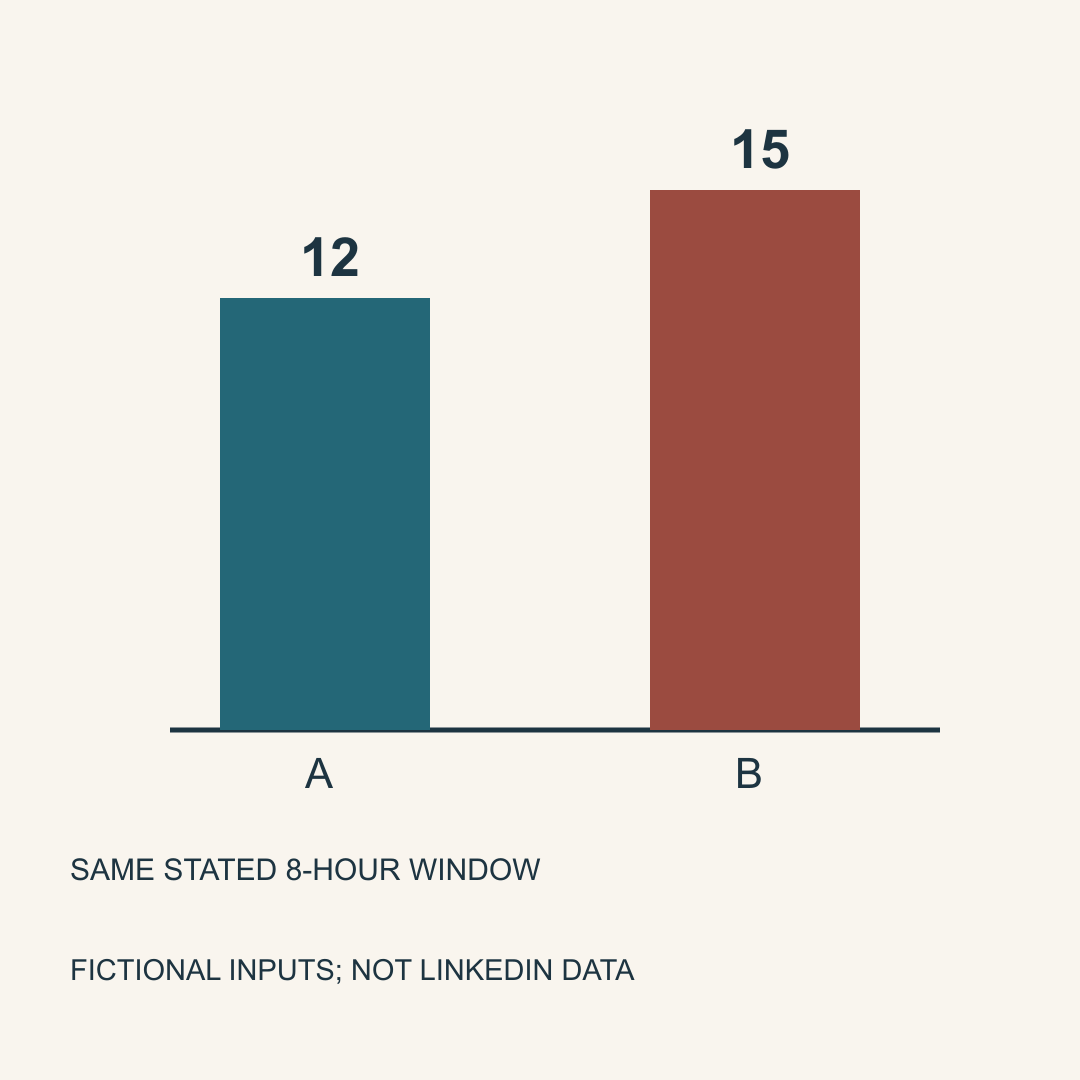
The portrait file is 1080 × 1350. Our deliberately chosen top square keeps the first 1080 rows: it preserves the bars and 12/15 but removes the time window and source note. The bottom square starts at row 270 and removes the unit. These are actual local crop files, not predictions of LinkedIn’s crop positions. Merely finding both bars or matching a requested square size does not preserve the explanation.
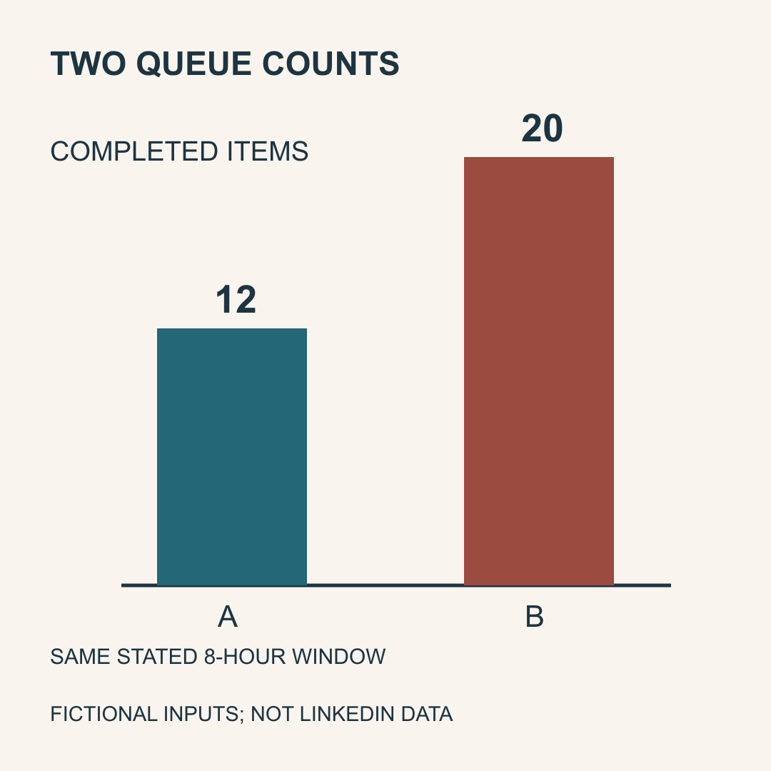
Containing the full portrait inside a square keeps the declared areas but scales its content to 80% and adds side space. The reflowed square instead rearranges the same counts and annotations. Inspect both choices at the intended display size. Keeping every declared area is a geometric check, not a device-readability or accessibility certificate. A separate stale square shows 20 instead of the current 15; correct dimensions do not repair that factual mismatch.
| Actual local file | What the exercise finds | Next decision |
|---|---|---|
| Portrait, 1080 × 1350 | Unit, window, source and counts retained | Review the actual intended view |
| Top square, 1080 × 1080 | Time window and fictional-source note lost | Recompose or retain the original shape |
| Bottom square, 1080 × 1080 | Unit lost | Restore the unit before using the excerpt |
| Contained square | Areas retained; content scale is 0.8 | Check the smaller text separately |
| Reflowed square | Current 12/15 and annotations retained | Bind the exact export and selected file |
| Stale square | Old 12/20 conflicts with declared revision r2 | Correct the source, not just its canvas |
Original constructed files: no native LinkedIn preview, phone test or reader observation.
Bind the source, exported bytes and the view you actually checked
The download includes original editable SVGs, actual PNG exports and crops, independent facts and plans, supplied observations, complete decisions and a private blank record. Its checker reads the generated PNG headers and pixels and compares the two crop files with the exact corresponding source rows. It separately checks source numbers and visible number labels in these known SVG fixtures. It does not recognize the meaning of arbitrary images or replace a person’s review.
Record the intended source revision, unit, period and counts before exporting. Then record the actual export’s dimensions, byte size and fingerprint. A same-named file or a design canvas setting is insufficient. The exercise holds a different selected local file and a supplied local view that clips the context. That supplied view is still a local fixture, not an observation of the LinkedIn composer or a recipient’s device.
A 320 × 400 local raster is available for narrow inspection. It falls below the photo help’s reported minimum width, so it is a viewing exercise rather than a recommended upload file. The nominal label scale is 320 ÷ 1080; no real phone or reader was tested. All fixture files are far below the reported 5 MB ceiling; neither an exact byte boundary nor LinkedIn’s compression was tested. The optional rebuild uses the recorded existing Node/Sharp and Python runtime without installation or network; font rendering on another host can differ.
- Write the actual comparison, unit, period and source before choosing a shape.
- Identify the areas that must remain visible; keep uncertain meaning checks open.
- Create the intended crop, contained view or recomposed export and inspect that file.
- Compare its source facts, actual dimensions and bytes with the intended version.
- Check the selected file and any actually observed preview separately.
- Review a suitable text alternative and the real target display when available.
- Keep prepared, uploaded, previewed and published as separate states.
Treat aspect range and multi-image layout as separate questions
Current ordinary-photo help also lists an aspect range from 3:1 to 4:5 and describes how the first image and image count can affect a multi-image layout. Two images can appear side by side, while three or more use a layout influenced by the first image; width or lower-row cropping can still matter. These source statements are not a complete layout algorithm. Changing the first image or its order calls for checking the actual offered preview again.
The exercise keeps the eventual native layout unknown even when three local files are individually checked. Do not infer that every label survives because every file has an acceptable shape. The same help says uploaded photos cannot be edited or resized after publication. Review crop, audience and text before an intended post; retain a private version record, and inspect any actual published result. This research uploaded or published nothing.
Sources & product references
Product details reflect the publication date. External features and interfaces may change.