The short answer
Give each series a visible identity beyond hue, preserve its values in text and review contrast in the actual export. Labels, line styles and point shapes can carry distinctions that a color-only legend loses. Text contrast and meaningful graphical-object contrast have different scopes; a rounded ratio or attractive palette is not a complete accessibility result.
What you’ll take away
- Use visible redundant series cues, not color names alone.
- Check the actual foreground/background values and required scope.
- Do not round a contrast failure into a pass or infer reader success.
Name the distinction the reader must recover
List what color currently means: which series a line belongs to, a category group, an ordered quantity or a highlighted point. Do not make red or green the only carrier of “failed” and “complete.” W3C’s Use of Color criterion concerns visible alternatives; a hidden alternative alone does not help a sighted reader who cannot distinguish the hues.
Keep the same category mapping across a series of images, a carousel and its text explanation. ONS recommends limiting unnecessary colors and using consistent category colors. When one category set needs no special grouping, a single suitable color can be clearer than assigning a different color to every bar.
Inspect a complete constructed two-series example
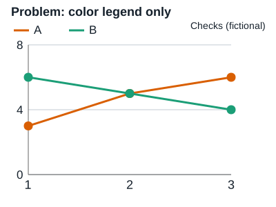
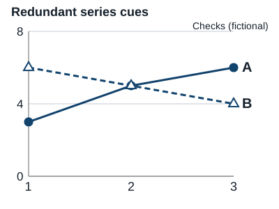
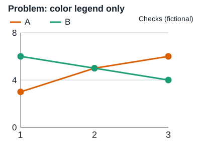
The original fixture has three observations. Series A is 3, 5, 6 checks; B is 6, 5, 4 checks. They meet at the middle value 5. In the problem figure, colored lines depend on a separate color legend. In the revised figure, direct A/B labels, solid versus dashed strokes and different point shapes carry the series identity.
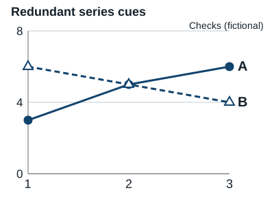
The revised marks deliberately do not depend on two distinguishable hues: both can use the same dark line color while their style and labels differ. All six counts are also available in the body and packet. This tests a specific encoding choice, not the proposition that every person can read every chart or that all grayscale views are equivalent.
| Observation | A: checks | B: checks |
|---|---|---|
| 1 | 3 | 6 |
| 2 | 5 | 5 |
| 3 | 6 | 4 |
Apply the right contrast rule without rounding
WCAG’s text criterion uses at least 4.5:1 for ordinary text, with a 3:1 threshold for qualifying large text and defined exceptions. The non-text criterion addresses visual information needed to identify controls/states and understand graphical objects, generally at least 3:1 against adjacent colors. These are distinct checks; measuring text against white does not settle every crossing line or state.
Use the actual declared foreground/background colors and the applicable method. The packet implements the sRGB relative-luminance calculation and preserves the unrounded result. For #777777 on white it is about 4.478:1, below 4.5:1 for ordinary text. Display rounding to 4.5 does not make that comparison meet the threshold.
Resolve three constructed color reviews
C1 — Constructed crossing series A 3/5/6 and B 6/5/4: the only distinction is hue. Decision: add direct identifiers, different strokes/markers and a complete data equivalent. Outcome: preserve series identity in the supplied revised figure without claiming a color-vision study or measured reader preference.
C2 — Constructed ordinary text #777777 on white: the unrounded contrast is approximately 4.478. Decision: compare the actual value with 4.5, choose a suitable stronger combination and recheck. Outcome: the original pair does not pass merely because a short display rounds it to 4.5.
C3 — Constructed multi-page recap: A is blue on one page but the same blue means B on the next. Decision: stabilize the mapping and keep visible A/B labels in each delivered page. Outcome: a checked consistency correction; a grayscale preview or palette name still does not certify all users or destinations.
Check the actual mark, text and alternative together
Inspect the delivered figure at its intended size. Thin antialiased lines, compressed labels, crop changes and background replacement can matter even when source colors have a good computed ratio. Check necessary adjacent boundaries, direct names and the complete text/data explanation rather than treating one numeric contrast test as the whole review.
Do not use a fixed pixel label size in a large source SVG as proof of a large-text exception after the image is scaled down. The relevant delivered size and typography matter. The original figures are static teaching material with full companion values; they do not certify LinkedIn processing, screen-reader navigation or human perception.
Keep the exact encoding and scope of the result
The worksheet records series/category meanings, original and revised marks, foreground/background values, contrast scope, unrounded ratio, export identity, complete data equivalent and actual checks. The packet contains original bilingual SVGs, constructed values and a rendering recipe using existing React/Recharts dependencies.
Relevant W3C color, text/non-text contrast and ONS color guidance was read on 1 November 2026. Arithmetic and native rendering checks concern the owned fixtures only. No private chart, real audience, accessibility participant or business result was measured.
Sources & product references
Product details reflect the publication date. External features and interfaces may change.