
The short answer
Build the page sequence before designing: a precise promise, the minimum context, a worked action, a check and a useful next step. Give each page a clear job and inspect the exported PDF at a realistic small scale. A document carousel is a document post; adding pages does not establish better engagement or understanding.
What you’ll take away
- A page should advance the task, not merely repeat the cover.
- Canvas pixels, PDF page units and displayed text size are different.
- Keep a text alternative and the editable source.
Start with one useful finish line
Use a document when the reader benefits from moving through a sequence at their own pace. If the whole answer fits clearly in a short text post, a carousel may add production work without adding information. State the finish line in one sentence and remove pages that do not help reach it.
For this constructed example, the reader should be able to compare two reported rates without swapping denominators. This is narrower than teaching all LinkedIn analytics. The sequence below is a storyboard for that job, not a measured optimal page count or an account case study.
Write a page-by-page storyboard
Draft headings and evidence before choosing colors. Each row should specify what the reader learns, which example supports it and how the transition works. Introduce the inputs before displaying a result. A surprising number without its units and source cannot carry the explanation.
The five-page example is deliberately short enough to review in full. Split a page when it contains two necessary actions; combine or delete it when it repeats another page. Neither nine pages nor twenty pages is a universal success condition.
| Page | Reader job | Concrete content |
|---|---|---|
| 1 · Promise | Recognize the decision | Two rates can use different denominators |
| 2 · Inputs | Identify the available source | Fictional post: 10 response events, 100 impressions; followers unknown |
| 3 · Calculation | Follow the supported operation | 10 / 100 × 100 = 10% response-event ratio per impression |
| 4 · Check | Reject the unsupported conclusion | This does not establish 10% of followers or unique people |
| 5 · Next step | Apply the distinction | Record numerator, denominator, source and observation time |
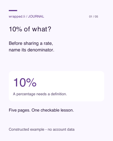
Read all five pages as text
10% of what?
Before sharing a rate, name its denominator.
10% · A percentage needs a definition.
Five pages. One checkable lesson.
Constructed example - no account data
Start with the inputs.
10 reaction/comment events. 100 post impressions. Follower count: unknown.
10 / 100 · Keep the exact units with the values.
Fictional observations, not results from an actual creator.
Constructed example - no account data
Follow the calculation.
10 divided by 100, times 100. Reaction/comment events per impression.
10% · This is the declared event ratio.
Events can repeat. Impressions are displays.
Constructed example - no account data
Not 10% of followers.
The follower denominator is missing. This ratio does not count different people who engaged.
Unknown · An absent value does not become zero.
Keep the limitation beside the rate.
Constructed example - no account data
Keep a useful record.
Metric and included events. Denominator and source. Observation time and post age.
Same scope · Compare matching definitions next time.
Definitions: LinkedIn post analytics
Constructed example - no account data
Use a complete example before designing your own
The downloadable PDFs carry the same five-page event-ratio example through a real export. It uses ten reaction/comment events and one hundred impressions, while the follower count remains unknown. The data are constructed for teaching. The final page links the member analytics definition; no private account was analyzed. All ten English/German pages were rendered at 360 pixels wide, and every intended line was independently extracted from the PDFs.
Start by opening every page and reading the HTML alternative. The ZIP includes editable SVG pages, the structured page text and the generator. Change the task and inputs in the source, then recheck calculations, labels, long lines and the exported result. The PDFs are not tagged or tested with assistive technology, and editable SVG import is not guaranteed in every editor. Preserve a usable text alternative instead of treating selectable text as complete access.
Test the text at the scale readers will see
Choose one consistent page shape and leave space around the main explanation. Use hierarchy to separate the claim, inputs and limitation. Do not hide the denominator or fictional-example label in tiny footnotes. A page that requires zooming to read its essential caveat needs a simpler layout.
Canvas size alone does not ensure legibility. For example, a 48-pixel label on a 1080-pixel design becomes about 14.2 pixels when the entire design is displayed 320 pixels wide. That is arithmetic for a constructed display width, not a claim about LinkedIn’s exact viewport or a universal font requirement. Test the actual export, not only your design at full zoom.
W3C recommends using real text where the same presentation can be achieved without images of text. Preserve meaningful text where your export allows it and provide a readable companion explanation. A PDF with selectable text is still not automatically tagged, correctly ordered or accessible.
Inspect the file and its distribution settings
Export a separate review copy and keep the editable source. Open every page in order; check missing fonts, clipped symbols, broken explanations, metadata and any sensitive names. Test a small view and a larger one. Our linked export experiment supplies original vector and raster examples; it does not test LinkedIn’s processing.
LinkedIn’s document FAQ lists a 100 MB and 300-page ceiling and one document per post. These are acceptance ceilings, not a target for this storyboard. Give the document a meaningful title and use the separate publishing guide for the current upload and verification workflow. Do not assume that post text, document title and embedded pages share the same editing rules.
Recognize success and plan a correction
Before publication, ask whether the exported file enables the promised calculation and explicitly rejects the wrong interpretation. Check every example against its inputs. If a page cannot be understood without a missing source or your spoken explanation, revise it before upload.
After publication, inspect the processed document and available download from the intended context. An uploaded file is not proof that the public order, crop and visibility are correct. LinkedIn does not let you replace the document inside the existing post; preserve the final source so a correction can be prepared. If the error changes the meaning, explain it rather than quietly repeating the claim.
Review the export against specific failure cases
Use the existing complete bilingual example as a reference, then run a page-by-page review of your own file. Check missing glyphs, cropped qualifiers, changed page order, rasterized fine print, stale values and links that no longer match their labels. Extracted text and rendered pages test different properties: a text extractor can recover an explanation that a crop makes visually unreadable, while a clear raster page may contain no selectable text.
For the 1080-unit example, a 48-unit label scales to 16 units at 360 wide, while 36 scales to 12. These are checkable geometric sizes, not human legibility thresholds. If an essential limitation is too small in the actual small view, simplify or split its content. A page-count target does not justify hiding it. Recheck the revised export, not only the editable source.
| Failure | Why one green check is insufficient | Review response |
|---|---|---|
| Missing or substituted glyph | Text extraction can still report the intended string | Render the actual page; repair font/export and recheck |
| Cropped denominator or source note | Full source text does not prove the visible crop | Inspect smallest view and preserve the qualifier |
| Calculation before inputs | All pages can exist in the wrong teaching order | Match exported order to each reader job |
| Raster text or untagged PDF | Visible clarity does not establish structured reading access | Keep a complete readable alternative; disclose untested access |
| New values in an old title or link | Filename and cover can disagree with the actual file | Compare source, exported values, title and destination |
Finish a complete review without inventing a reader test
The new worked review cases trace a clipped denominator, a page-order error and an inaccessible explanation through the exact fix and remaining check. The blank private record gives each page its input, reader task, visible result, text-alternative reference and unresolved destination check. Use the separate original SVG/PDF source bundle for editing; this record does not replace it.
For a genuine reader test, ask an eligible willing reader to perform the promised task and record the actual result. Do not complete that field with the export checker’s output, a simulated persona or a guessed preference. A documented local review can say “all intended pages and text checked”; it cannot say “readers prefer this” or “LinkedIn processed it correctly” before those observations exist.
Sources & product references
Product details reflect the publication date. External features and interfaces may change.
- LinkedIn Help: Document uploads FAQ
- W3C WAI: Images of text
- Original export experiment: complete dataset
- Original complete example, sources and export checks
- Editable bilingual source and PDFs
- LinkedIn: Definitions used in the worked example
- Original complete bilingual worked cases and private records
- Vollständige eigene Fälle und private Arbeitsbögen


